


- 1 Thorough Design Analysis: First approach the actual Figma design and familiarize yourself with a structure, elements types, colors, and its layout in order to code it properly.
- 2 Useful Plugins: Enable plugins where from Figma designs, you can directly export React components using Anima and enable Tailwind CSS integration.
- 3 Consistent Conversion Workflow: From Figma, reproduce the ‘map’ of the components in React, use Tailwind CSS to add style, and ensure interactivity’s smooth integration.
Introduction
Figma is a popular design tool that allows designers to create stunning user interfaces (UI) for web and mobile applications. After completing the design, developers must transform these designs into actual code to bring them to life. In this blog post, we’ll explore the process of converting a Figma UI design into React code using Tailwind CSS, a utility-first CSS framework.
Why Pair Tailwind CSS with a Figma-to-React Workflow
Before diving into the conversion process itself, it is essential to understand why Tailwind CSS proved to be a great choice for this task — as a CSS framework, it has certain characteristics that make the conversion process much less error-prone and more reliable.
Most importantly, using Tailwind CSS as a utility-first framework keeps developers focused on the design and the code’s functionality. The framework allows you to build designs by adding classes to elements directly in code, which means that each measurement and utility has a direct analog in code. When working in Dev Mode and being able to see the pixels, it becomes much easier to determine what width, height, or color should be applied to an element based on the design. Aside from reducing the margin of error during conversion, this approach also helps keep the design consistent throughout the development process.
The reason for this is the fact that Tailwind CSS design tokens are used as the foundation for building any design in the framework. Elements are built with spacing, color, and font size as their foundation, which are then turned into utility classes. As such, each component created in React will have its measurements and design properties defined in accordance with the provided design tokens, reducing the possibility of elements appearing differently on different devices or simply having inconsistent measurements.
Understanding the Figma Design
Begin with a thorough examination of the Figma design, understanding its structure, components, color schemes, typography, and overall layout. Familiarize yourself with crucial design elements such as buttons, input fields, and cards, pivotal in the conversion process.
Analyzing the Figma
1. Sign Up/Login: Visit the Figma website and sign up or login for an account.
2. Inspecting the design components:
- Inspecting the Figma: Choose the flow you’d like to examine and click on Open in Editor to delve into the design elements in greater detail.

- Design Flow and Functionality: Utilize the Play option in Figma to experience the functionality of the UI design and navigate through the screens effectively.

- Dev Mode: Enable the Dev Mode option in Figma, it provides an interface tailored for developers to inspect and extract code directly from design files. It allows developers to view design specifications, such as dimensions, colors, and typography, aiding in the seamless translation of design elements into code. Additionally, developers can access CSS, Swift, Android XML, and other code snippets to expedite the development process and maintain design consistency across platforms. This feature streamlines collaboration between designers and developers, promoting a more efficient workflow.

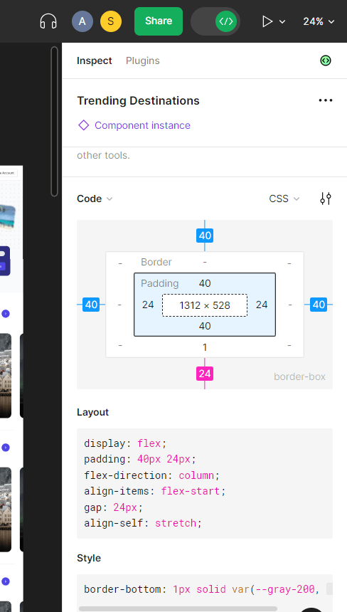
- The Export feature inside the Inspect section in Tailwind allows users to generate optimized, responsive image assets for their web projects, enhancing performance and user experience.

Useful Plugins to convert Figma to code
There are several useful plugins to convert Figma designs to React code and integrate Tailwind CSS. Some of them are Anima, Ziplin, Figma to React, Figmify and Figma Tokens.
Manual Conversion vs. Plugin-Based Conversion
Prior to choosing the method of implementing a Figma design in the code, it may be worth considering the trade-offs between making the conversion manually and using one of the aforementioned plugins. Each option has its advantages and disadvantages, which should be carefully weighed before making a final choice.
The conversion of a Figma design into React components requires writing code manually by a programmer, who studies the design in the Dev Mode and implements it in the programming language. This technique usually results in cleaner code, which is easier to work with, since all decisions about the component structure and repetitive patterns are made by a person. However, such a method is much more time-consuming due to the need to write computer code, even if it only involves copying and pasting. Nevertheless, this time is spent on a single occasion, and it can be used for other tasks instead of conversion.
Converting Figma to React using plugins highlights all the disadvantages of this technique. Although using programs removes the need to write code manually, it often turns out that the automatically created code requires more cleaning and optimization than might be necessary. Plugins are convenient in those cases where a lot of time is needed for the conversion of a large number of screens with complex elements. However, one should be prepared for a significant amount of duplicate code, unnecessary nesting levels, and overly specific class names. In practice, such a method is often used in combination with the previous one, when a designer transfers the generated code to a programmer, who subsequently cleans and optimizes it. This way, the benefits of both methods can be used, since most of the time-consuming work is taken care of by the plugin, while the programmer’s task is only to adjust the new code structure.
To add a Plugin in Figma:
- Access the Plugins Panel: In the Figma interface, locate and click on the “Plugins” tab in the left sidebar.
- Browse or Search for a Plugin: In the Plugins panel, you can browse through the available plugins or use the search bar to find a specific plugin you’re looking for.
- Select a Plugin: Click on the plugin you want to add to view more details about it.
- Install the Plugin: If you’ve chosen a plugin, click the “Install” button to add it to your Figma account.
- Authorize Access (if required): Some plugins may require you to authorize certain permissions. Follow the on-screen instructions to grant the necessary permissions.
- Access the Plugin: Upon installation, access the plugin, which will subsequently appear in the Plugins panel. Click on the plugin to use its features and functionalities.
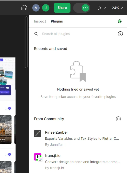
Here, we will explore the features of two highly useful and popular plugins for converting Figma designs to React code and integrating Tailwind CSS.
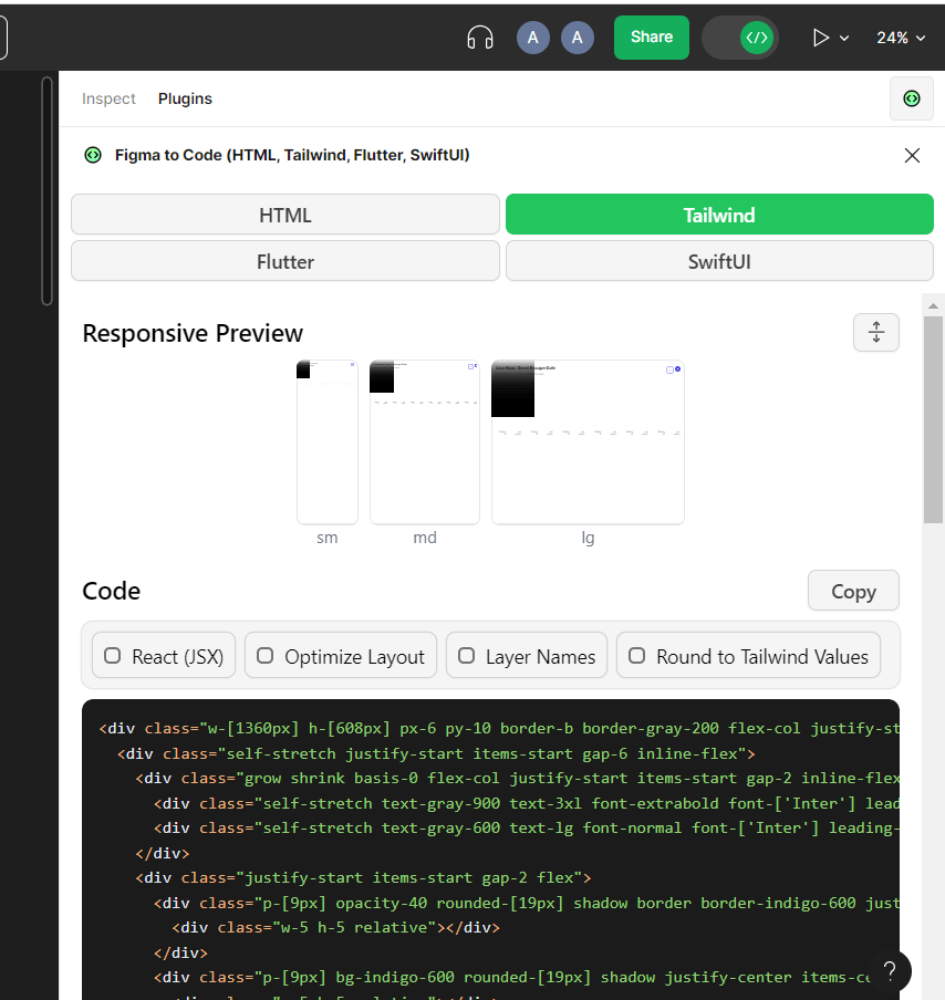
Figma to Code
- Code Generation for React Components: These plugins generate React components based on Figma designs. The generated code includes structure, styles, and sometimes interactions of components.
- Tailwind CSS Integration: Some plugins integrate with Tailwind CSS, enabling direct usage of Tailwind utility classes within Figma. This aligns the generated code with Tailwind CSS styling.
- HTML and CSS Export: Figma to code plugins export designs as HTML and CSS, forming a foundation for web development. This includes design structure and styles.
- Export for Flutter: Plugins offer export options for Flutter, facilitating code generation compatible with Figma designs for mobile, web, and desktop apps.
- Export for SwiftUI: Plugins export Figma designs as SwiftUI code, compatible with Apple platforms.
- Customization Options: Designers can customize parameters before code generation, like design tokens or responsiveness settings.
- Design Consistency: Plugins aim to maintain design consistency from Figma to code, ensuring accurate reflection of design intent and style choices.
Common Challenges When Converting Figma Designs to Code
A few issues tend to crop up while converting Figma to React with Tailwind, whether one uses a manual approach, plugins, or a combination of the two.
The responsive design is usually not fully worked out in a Figma file, as it only showcases a couple of common breakpoints, and the rest are guessed by the developer while building the component. While something as simple as adding responsive variants in Tailwind is easy when the design explicitly calls for it, the implicit ones have to be reasoned out and/or clarified with the designer.
Figma projects sometimes make use of non-standard fonts or spacing, which can cause issues while building the component, especially if one is not using the exact same font sizes or spacing values as specified in the design file. It is usually better to extend Tailwind’s config to incorporate project-specific values, as opposed to working with the closest available alternative.
Many design systems make use of interactive states – hover, focus, validation, and more – but these are often not fully specified at the component level. As someone who has worked extensively with Figma, I can confirm that most components will rarely, if ever, showcase all possible states in their design, and the visual differences between them have to be inferred at the implementation stage. Asking the designer to clarify the differences between states in advance can save a world of pain later.
And finally, the exported assets (icons or images) sometimes have unnecessarily long file names or can be completely unoptimized, which affects the loading budget of the final website/application. It is important to optimize the exported media before committing it to the repository if the Figma export settings were not configured to do so.
Conclusion:
In summary, transforming a Figma UI into functional React code using Tailwind CSS involves a detailed approach. It includes understanding the design intricacies, mapping components accurately, applying styles precisely, and integrating interactivity seamlessly. To begin, a thorough analysis of the Figma design’s elements, layout, color schemes, typography, and interactive features is essential. Figma plugins like “Anima” or “Figma to Code” can automate this process, expediting initial development phases.
Building on this foundational understanding, developers efficiently map out components to mirror the Figma design’s structure in React. Tailwind CSS aids in styling with a utility-driven approach that matches the Figma design. Integrating interactivity, like event handling and state management, brings dynamism to React components, aligning with the Figma design’s user experience.
Consistent organization and reference to the Figma design remain crucial throughout the conversion process. A structured workflow and adherence to the design blueprint ensure a smooth transition from Figma to React, resulting in a cohesive application. Armed with this guide, developers confidently bridge the gap between Figma UIs and React code.